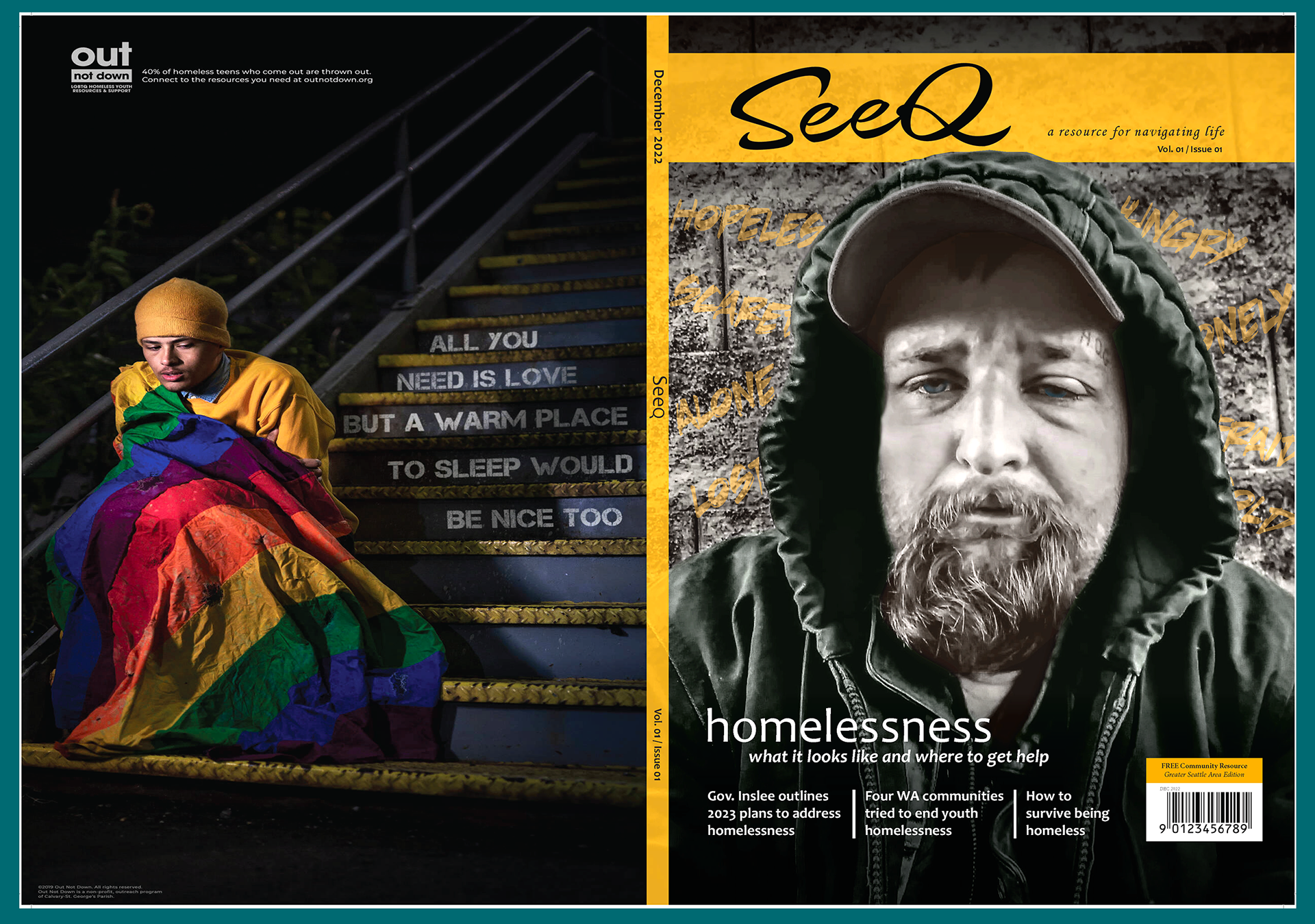
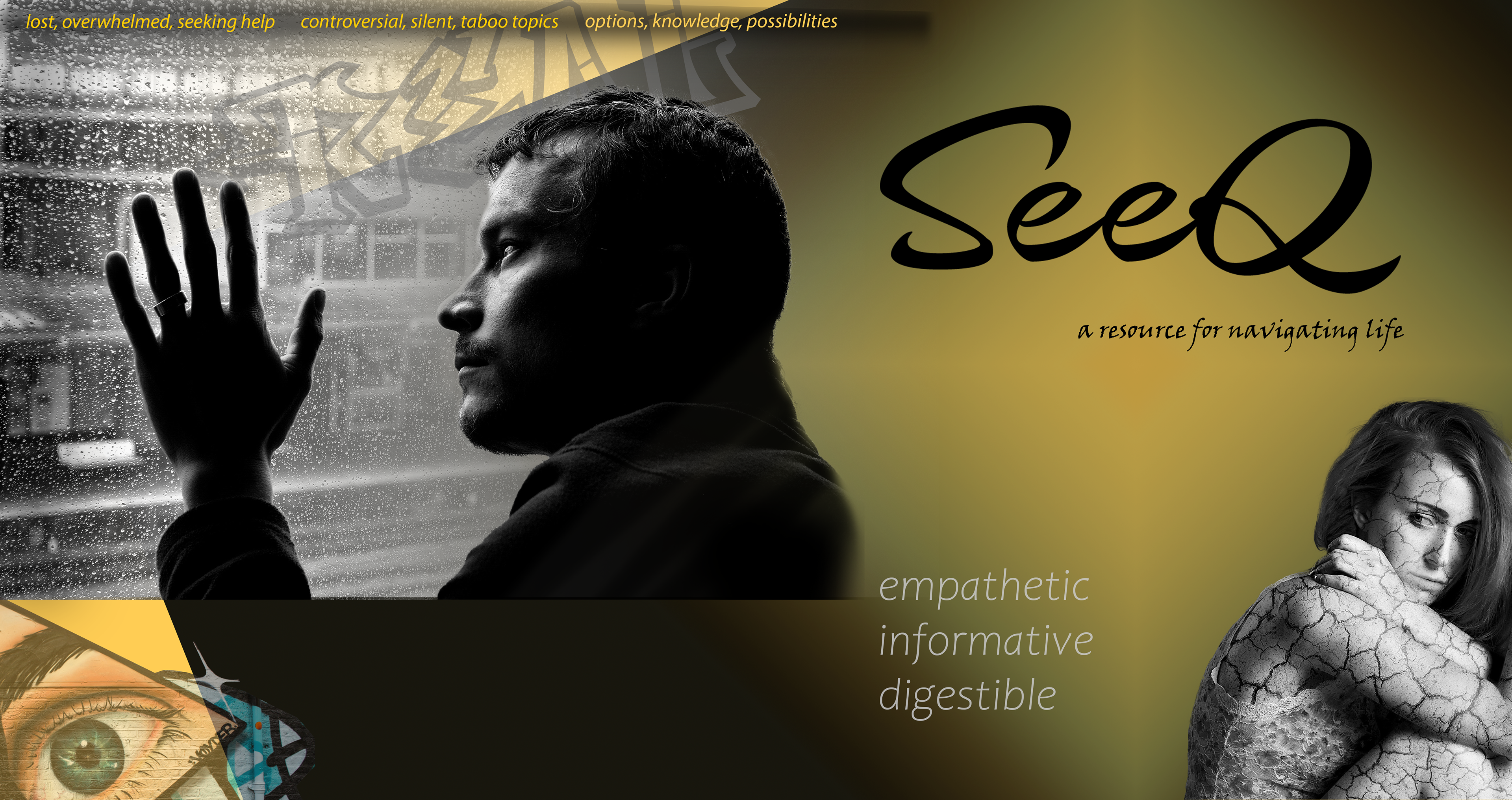
front & back cover
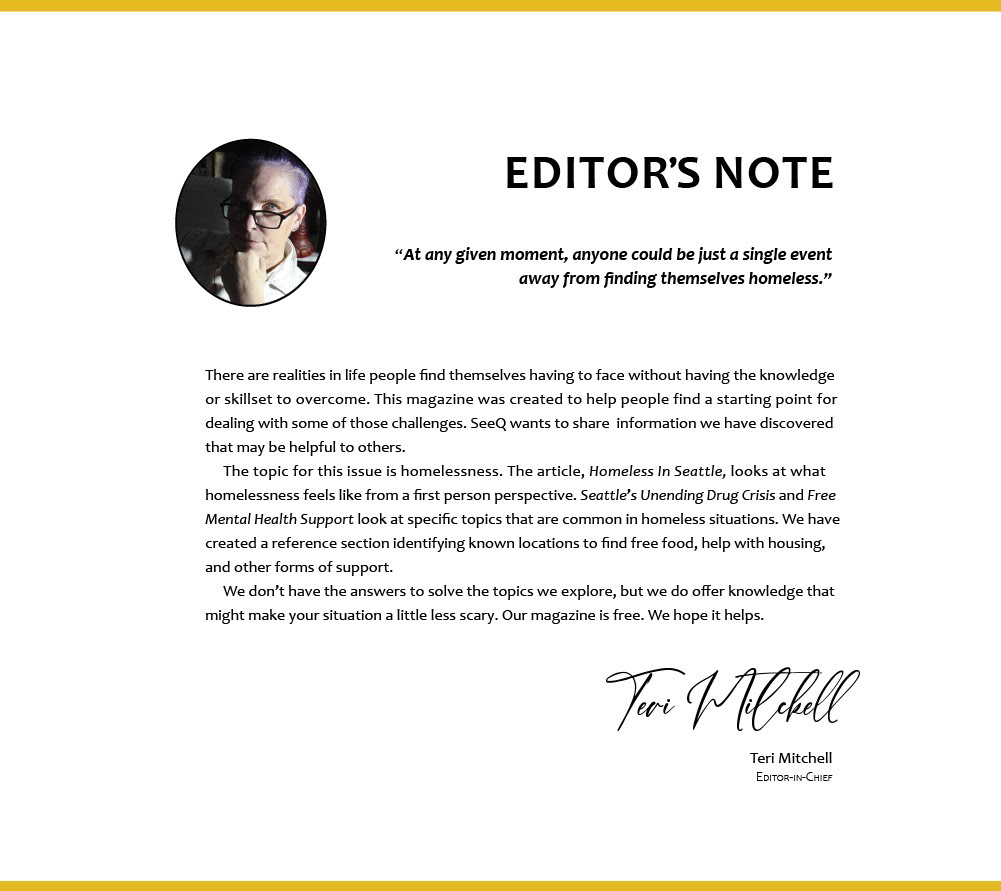
letter from the editor
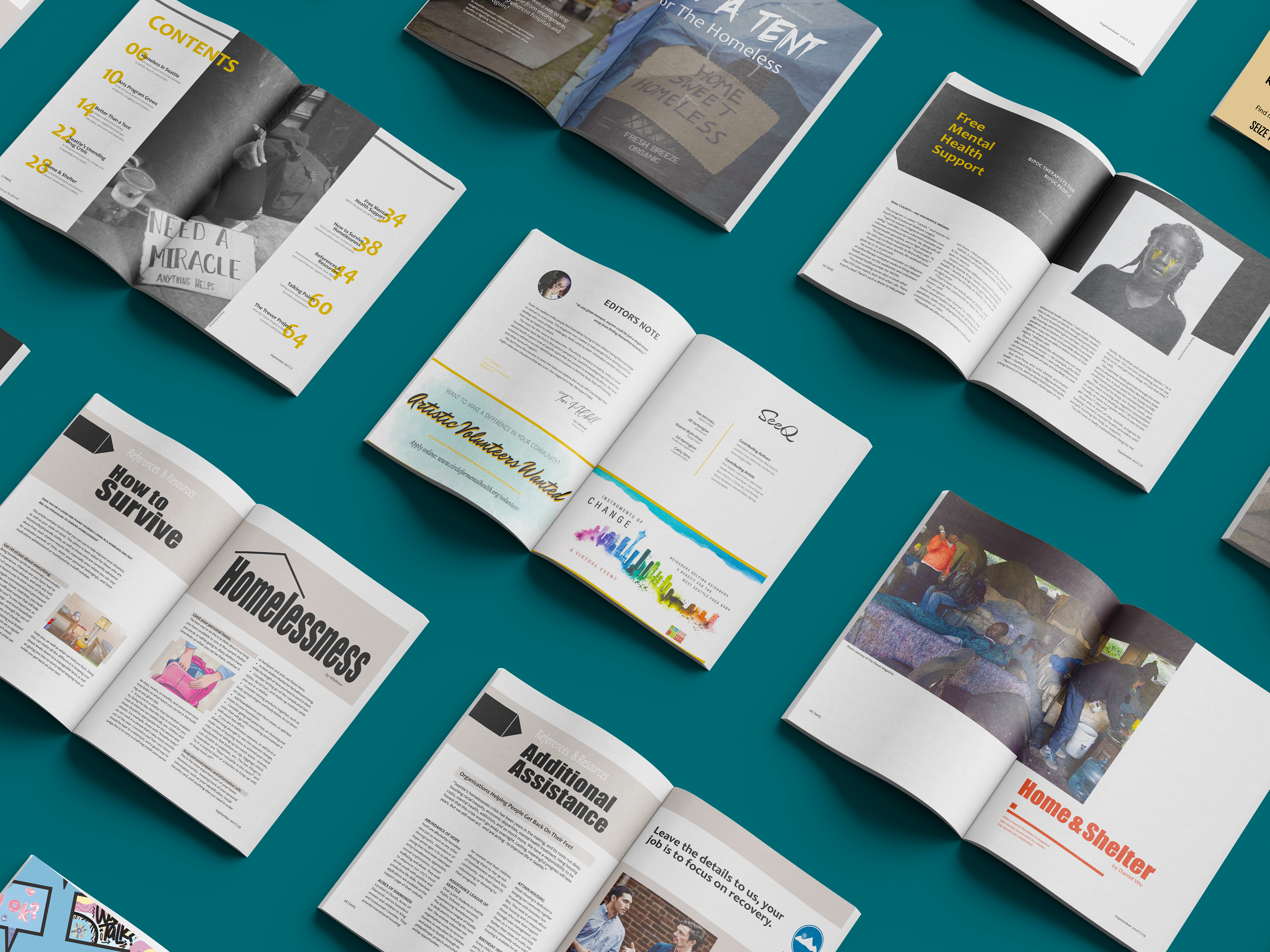
page spreads
Overview
Craft a magazine centered around a topic of choice.
Create a hand-processed, printed, and bound copy as the final deliverable.
Roles: researcher, art director, designer, editor, printer, binder
Duration: 11 weeks
Tools: InDesign, Illustrator, Photoshop
Team: solo
Client: school project / SeeQ Magazine

Problem
Life often presents unexpected challenges, leaving individuals feeling
ill-equipped to manage them, resulting in a sense of confusion and bewilderment regarding the next steps to take.
ill-equipped to manage them, resulting in a sense of confusion and bewilderment regarding the next steps to take.
Solution
SeeQ is intended to be a free monthly magazine offering information and insightful articles that empower individuals to better understand and navigate issues that affect their lives.
The cost of the magazine is covered through advertisements, grants, and donations.
The initial topic will be homelessness.
Future potential topics to explore may include mental health issues, drug addiction, age issues, gender identities, crisis lines - levels of service and effectiveness, Autism and other neuro-diversities, and more.
Research
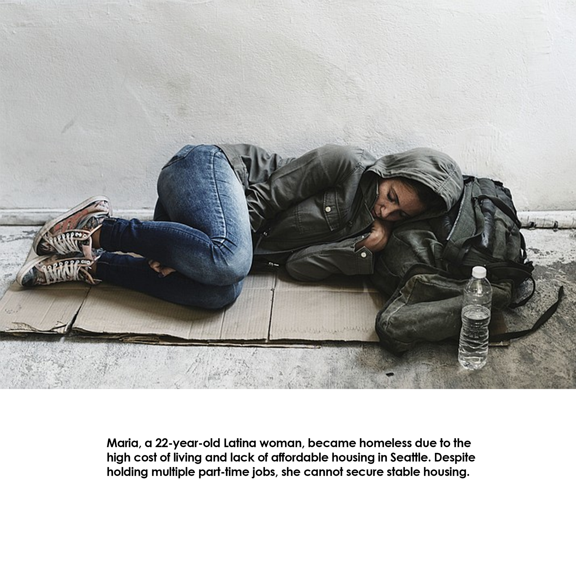
As the editor and researcher for this magazine on homelessness, I explored the multi-faceted aspects of this pressing issue. To authentically capture the diverse nature of homelessness, I delved into the demographic landscape, encompassing individuals of varying ages, races, socioeconomic backgrounds, and genders.
.
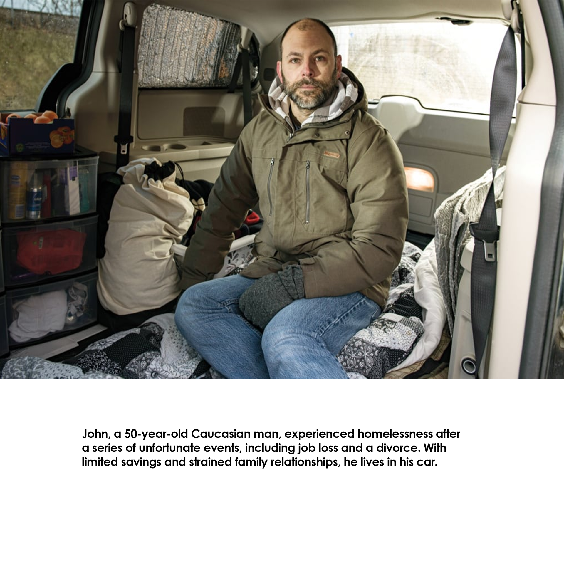
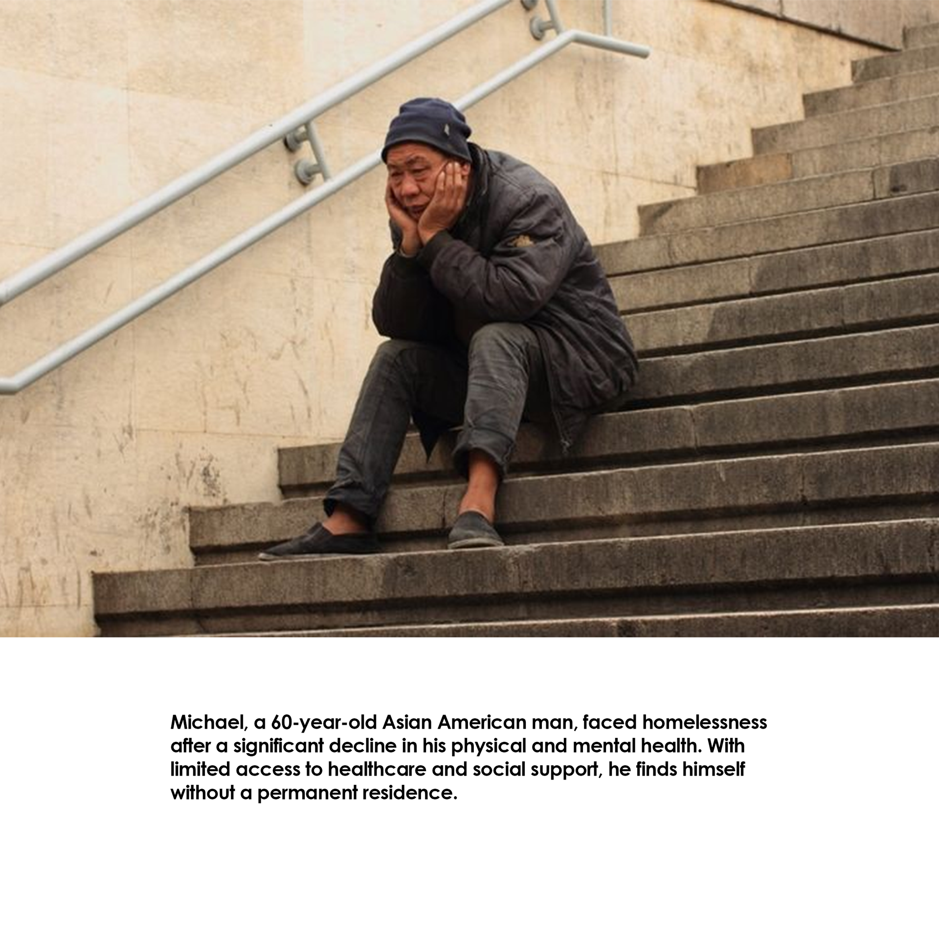
Persona 1
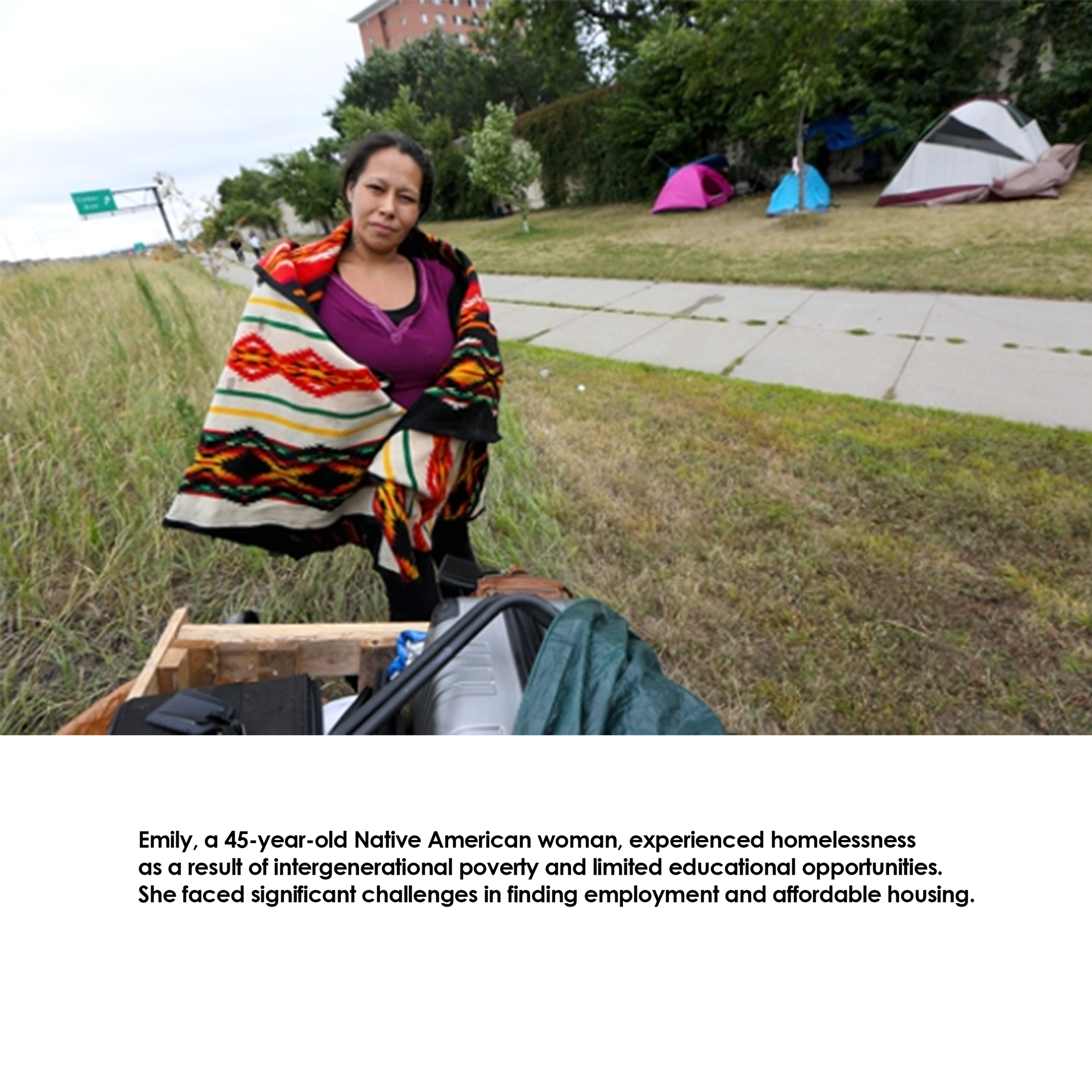
Persona 2
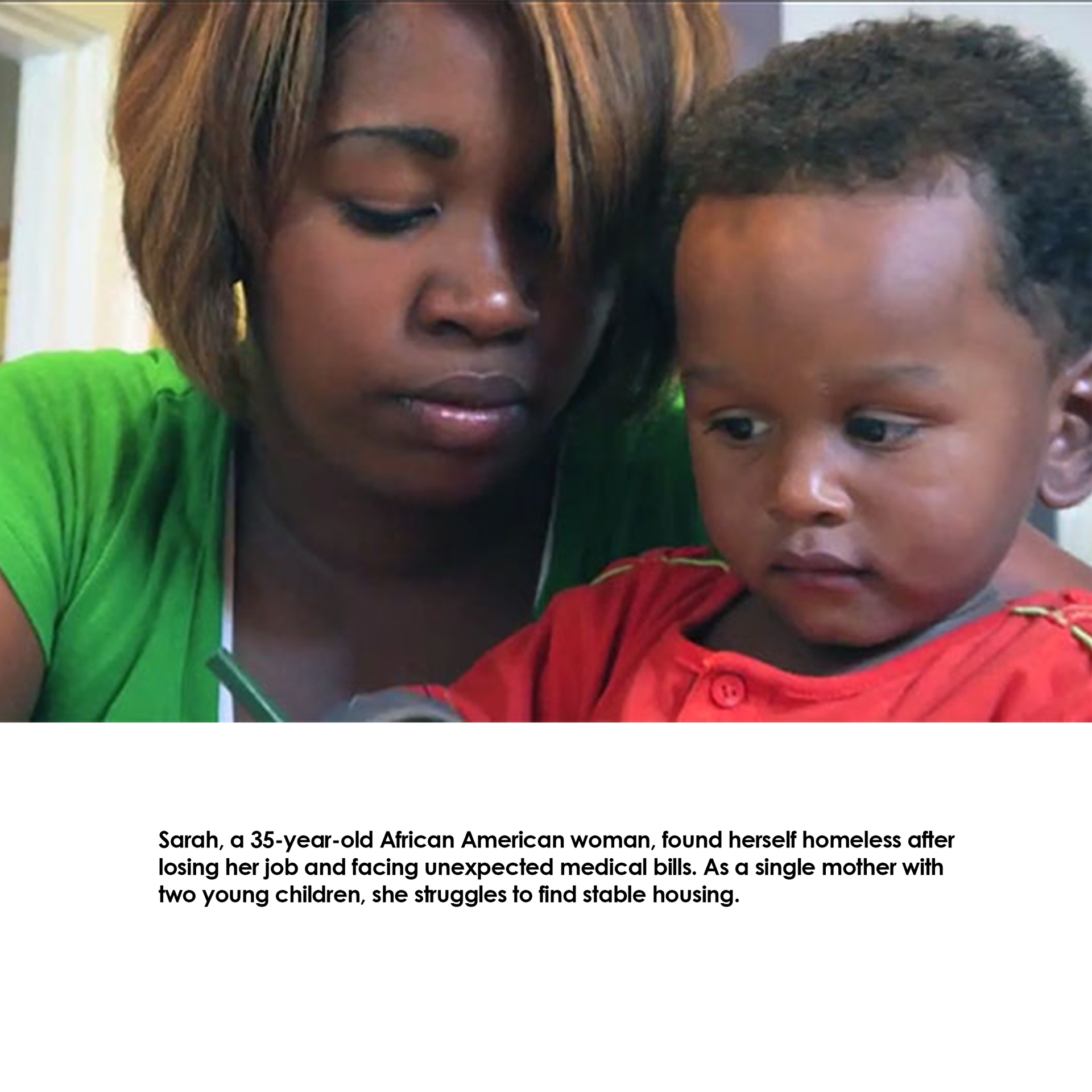
Persona 3
Persona 4

Persona 5
Persona 6
Click on image to enlarge
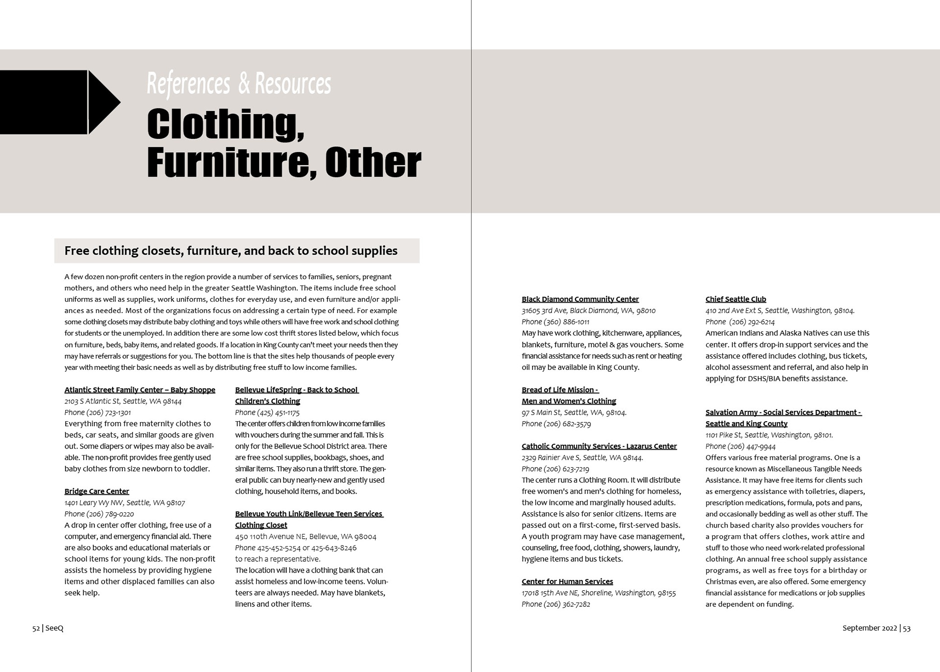
Reference and Resources
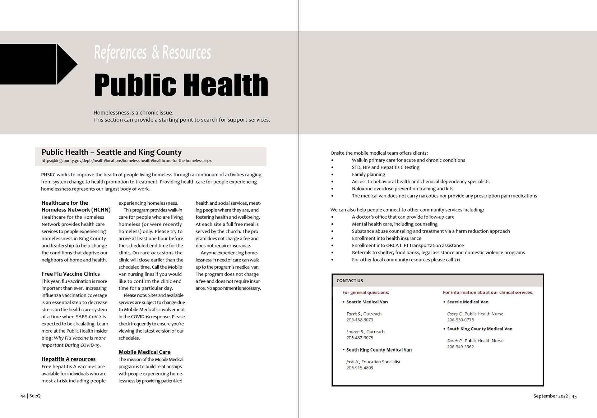
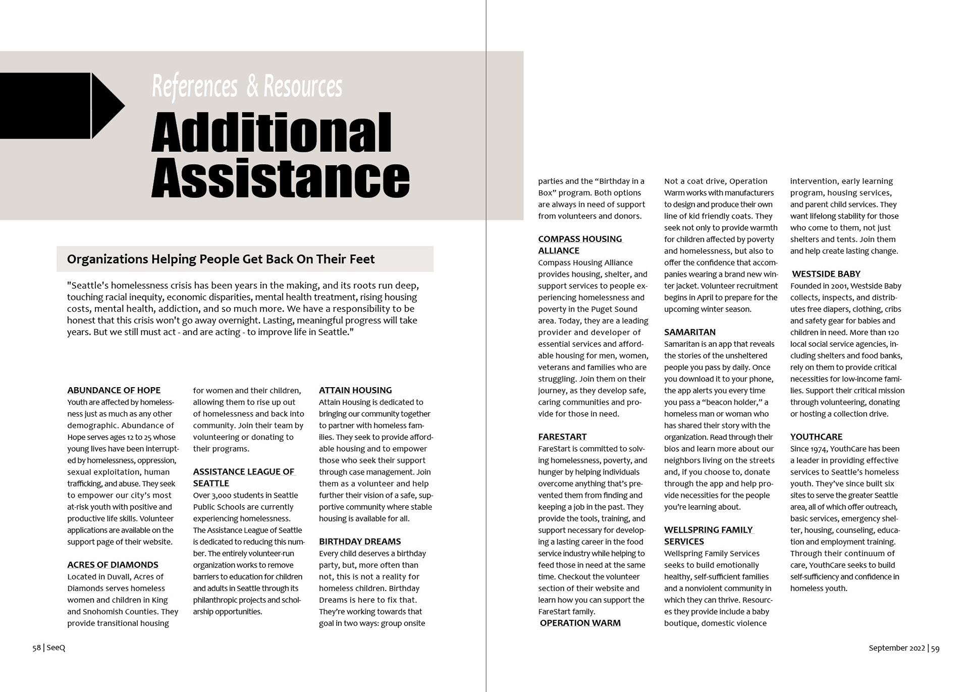
One of the key components of this magazine is the creation of a comprehensive reference and resources section specific to the greater Seattle area. This section serves as a vital tool, providing essential information about local sources of support for various needs, such as food, housing/shelter, clothing, healthcare, dental clinics, and other forms of assistance..


Click on image to enlarge
Contents
When sourcing articles, the focus is on personal narratives, practical guidance, real-life encounters, and examples of impactful organizations striving to make a difference in the realm of homelessness. By curating a diverse selection of articles, the aim is to provide readers with a well-rounded understanding of homelessness, while inspiring empathy, action, and hope.

Moodboard
The moodboard captures the essence of homelessness with empathetic and reflective imagery, evoking a somber and respectful tone. The images depict individuals with faces carrying traces of both resilience and vulnerability. It invites viewers to pause, reflect, and embrace a deeper understanding of the human stories behind homelessness.
Text/Fonts
The customized wordmark for SeeQ magazine is based on the Salamat font, tailored to evoke a sense of hope and possibility. Its design incorporates fluid curves that represent a symbolic journey, while the capitalized first and last letters provide structure while the lowercase letters portray support. The intentional spelling of "SeeQ" acts as a rebus, subtly conveying the idea of seeking answers and information. Each article title showcases a unique font that captures the distinct visual identity of its topic.
The body text, Candara was selected for its exceptional readability and legibility. Its open, spacious apertures and distinctive letter shapes ensure comfortable reading across different mediums. This versatile font enhances accessibility and adds to the overall aesthetic quality, providing a seamless reading experience.
This is an example of what Candara looks like as a typeface.

Reflection
My knowledge of inclusive design greatly influenced the decisions made regarding the form and structure of SeeQ. Considering the diverse backgrounds and life experiences of the populations represented in this magazine, I approached the design process with empathy and a commitment to embodying a sense of belonging with a focus on providing practical assistance. People are at the heart of it all.
The layout is inviting and approachable, ensuring readability for readers from all walks of life. Text blocks are thoughtfully grouped together and positioned lower on the page, fostering ease of navigation and accessibility. By considering the unique needs and perspectives of diverse populations, SeeQ transcends its individual elements, creating a collective representation of unity and striving to make everyone feels recognized and valued.
.